|
|
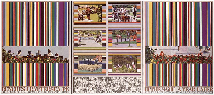
This picture began its existence with a chance meeting between myself and a postcard on Euston Station at 8.05 a.m. on Tuesday 17th February 1970. Most of the many postcard purchases that I have made have the feeling of Ezra Pound's category, 'not source material but relevant'. This one however spoke to me directly of a subject I had long wanted to tackle, that of mortality. Stark light fused the group while better delineating its member in their isolation and separateness. They were the assembled cast of a tragedy and/or its spectators: the ironic brightness of council flowers and the drab gaiety of the surrounding concrete parkland reinforced these impressions. Although the group, and its immediate surroundings (the letterbox proportions that were to make it Image 1 were already dictating themselves) seemed self-sufficient, it was not self-explanatory. Corroboration was called for. Corroboration by repeating the image fallibly, a method I had used previously in a picture called 'Hitchcock', suggested itself, but seemed inappropriate on reflection: the supporting evidence should come from outside, from different people in different places who yet shared a phase of fate, and were similarly condemned to enact it for ever and repeatedly on the surface of a postcard. My destination that same day was Wolverhampton College of Art. Upon reaching it I found that the office staff had collected together all the postcards they had sent each other while on their several holidays the previous summer; cards from Lugano, Cleethorpes, Salzburg, the Isle of Wight etc. The coincidence of thus coming by a random selection of (mostly peopled) summer scenes, did seem the solution. Because there were so many unifying factors (provenance, purpose, sunshine, unfactitiousness of choice etc.) another such factor could by poeticall legitimate extension be added; the postulation that the source photographs for these postcards were all taken in the various places at the same moment in time and that that was also the instant represented in the postcard of Battersea Park which was my starting point. Thus the serial and comic strip writers' use of the link-word 'meanwhile' could be adopted to connect Image 1 with other images. Although its function was to become more oblique, this word (alone, except for the more factual and descriptive 'Battersea Park') remained unaltered through all the stages of the picture and its title's development. Although few decisions had been made, enough was known, within a fortnight or so of finding the initial image and its probably companions, to decide on a format and to order canvases. The format chosen resulted from a decision already made that the painting of Image 1 would conform to a system and that its procedures would be externalised in the form of a catalogue of the colours used in order of their used, as I had done in some previous works (cf. Appendix 1); the only difference here being that I wanted to make this abstract and procedural section significantly larger than the figurative image, in order to give some priority to the process. This priority is only one of area since the colours, although they are ingredient to the image, are antagonistic to it in their solidity, clarity and verticality; the serve to emphasize the atmospheric frieze they both support and bear down upon. The brashness and contrast of the stripes also makes the image seem more harmonious and unified than it would appear on its own and makes it have, despite its bright flowers, a more sombre and tragic mood. I decided to use separate canvases; partly because of confined studio space, partly because the picture was being already thought of as compartmentalised (a technique which also related to the postcard), and partly because of the flexibility of being able to add more units if necessary; in the background also was the fact that a large canvases are particularly white and terrifying, and Adrian Berg's maxim that one should 'never paint a picture that won't fit into a London taxi'. The actual width of the canvas to be ordered was determined by deciding that the excerpt from the Battersea Park postcard would stand a magnification of times ten; allowing for some margin either side this gave a convenient width of 34". This magnification would make the image 8 3/4" high. Thus the second canvas could contain six images of this same height surround by their individual colour charts and leaving a space for a text at the bottom which would also be 8 3/4" high. The overall height of each of the sections of canvas B would then be 11 1/2" and this height was consequently introduced into canvas A as the striped area: the top of the image to the top of the striped area would then be the same measurement as from the top of the image to the bottom of the space left for lettering. All the proportions within the picture are interrelated in this way. Both canvases arrived in the studio at the end of March 1970 and the picture was actually started in the first week of April. A notebook drawing of the 4th April here reproduced shows the state of the ideas for the picture at this time. In this drawing some of the measurements mentioned above are indicated, although the canvas dimensions are mistakenly put at 36" x 48". Another interesting aspect of this drawing is that the stripes are indicated as going horizontally in A and vertically in the sections of B, although a drawing on the previous page of the same notebook and done on the previous day has them going in their eventual directions. The mention in fig. 3 of Achilles and the tortoise refers to a procedure of staggered stripes used in a painting done at that time (cf. Appendix 1). One of the things that interests me in coming back to this drawing is the occurrence of the postcard-album corners in the little sketch at the bottom of that page, since this device lay dormant for a year, to reappear in the painting (probably called Concorde) which I am working on at the moment; strangely enough without my realising that I had thought of it before. The first of all the notebook drawings (31st March 1970)(fig. 4) shows the tentative beginning, with the placing of Image 1 as yet undecided and a more solid block of alternating diagonal stripes for canvas B. Canvas A was first tackled on its own. The vertical intervals were measured across from left to right. The varying widths of these intervals were determined by the same coin-tossing procedure I had used in other pictures (cf. Appendix 1). The basic unit of these (and the smallest common unit in the picture as a whole) was 1/4". The random series when completed gave 67 intervals ranging from 1/4" to 2 1/4". I estimated that seven colour-mixes should suffice to paint image 1 together with an underpainting to give weight to the pigment. (The postcard after all only uses four plus the white of the paper: I intended to apply the white rather than use the colour of the primed canvas). The estimate of seven colour mixes gave a choice between dividing the image into eight sections (using 56 colors out of the 67, leaving eleven colours for the underpainting) or nine sections (using 64 colours for the underpainting) or nine sections (using 63 of the 67 colours and leaving four for the underpainting). I opted for the former division into eight since this is a convenient division of an area and since I thought that four colours would be insufficient for a substantial underpainting. A curious chicken/egg state of affairs subsisted in this picture and others with regard to the relation of stripes to image. The image generates the colours to fill the stripes; the stripes condition the procedure of the painting of the image. The reason for the existence of more stripes than the number of colors necessary for the image is that a great number of stripes be generated for use in the studio, some to make pictures entirely composed of stripes and some to make other images. On balance the stripes have the upper hand and it is the painting of the image that is forced to be extended, artificialised, broken into sections and to be executed in inappropriate colours. Thus the space left for image one was divided into eight sections as was the extract from the postcard. These sections were to be painted one after the other from left to right. Once each section was finished it could not be altered; this irreversibility allows the sections to chart and indicate the progress made in choosing the right balance of seven colours and in the manipulation of them. The scene of image 1 was first roughed in with colours deriving from other paintings being done in the studio at that time. These first eleven colours proved not entirely apposite and their existence caused some difficulty throughout the later painting of the sections. It was found at this point, at a recount of the stripes, that I had been mistaken and that there were 66 rather than 67 intervals; consequently the eleventh colour had also to be used as the first colour of the final painting of the first section. Although the actual content was not then known the schema of canvas B was drawn up. Since the total of the heights of the panels in B had been made equal to the width of the image in canvas A the same set of intervals was used for these, proceeding from top to bottom. Thus there were six panels in three horizontal pairs with three different sets of intervals, i.e. with different numbers of colours with which their images were to be painted: the lowest pair has eighteen intervals and the middle pair twenty-five. This made it advisable that the simpler images should occur in this lower pair of panels. (Of course this did not quite happen as planned since other considerations became more important.) Apart from the proposed incantation of names (Lugano, Miramare Rivazzura, Isle of Wight etc.) which would have been insufficient, it was not known what would occupy the optimistically large space at the bottom of canvas B. The unifying motif of the work, benches (as the stationary vehicles of mortality), emerged very slowly. There is no notebook reference to benches in the pages up to the beginning of July 1970. The notebook that was kept between July and October was lost, ironically enough on that same train journey from London to Wolverhampton on which in February the picture had been first thought of. In the notebook that replaced it, which was started on October 15th the picture is described as 'Benches' on the first page. However two of the most influential acquisitions were made in March 970; on the 2nd I purchased the card containing image 3 in Bournemouth and on the 24th I received the card containing image 2 from Richard Morphet (from Harrogate via Stockwell). Less and less work was done on the actual canvases between April and the end of August since and impending exhibition at the Angela Flowers Gallery in September 1970 meant that I concentrated on paintings that were likely to be finished before the date of the show, especially an ambitions though not very large picture called 'O Cezanne, O Chateaux' (included in Postcard Compositions). Nonetheless the material for canvas B was being gathered and sifted. The postcard for image 5 was bought in Bournemouth on the 18th May 1970, that for 6 in Brighton on the 15th June and that for 7 in Cardiff on the 8th August. These postcards must have decided the issue; certainly by mid-August the picture was called 'Battersea Park; Bench Sadness' in a pencil note on the canvas itself. At this time also I was studying Emblem books of the 16th/17th centuries (I had had a copy of Quarles since 1964 but had recently acquired an Alciati and a facsimile of the Minerva Britannica of Peacham as well as borrowed copies of Whitney and Withers). Thus the search was now not so much for images of the topos 'mortality' but rather for its emblem; wherever I found morality I found benches. Admittedly other emblems suggested themselves: litter bins seemed also present on most such cards (they appear in B2 and 3, the first two of the images painted) but were absent from the excerpts on canvas A and absent from the Brighton card (image 6) which in all other respects was such a potent ikon. Much later in the painting of the picture it occurred to me why the association of benches with mortality was strong in my mind: my brother had told me (when I was about twelve) that the bench in front of Ashton's the S.E. London undertakers had been put there in order that old people might sit down to rest on it, and dying there, provide trade. It was also on a park bench on Clapham Common that I spent much the dismal day on which my father died. By the end of August 1970, with the studio suddenly clear of all the work that went to make the exhibition already mentioned, I was ready to take up the picture again in earnest. In fact, apart from a brief trip to Germany that winter, the picture was worked on almost every day from that time until its completion on the 16th April 1971. The emblematic appropriateness of image 2 with its character of an Introit made it an easy choice as the first image to be painted on canvas B. This left me with a group of about fifteen postcards (the rule had been made implicitly more or less from the start that all the images in the picture should derive from picture postcards which were currently and ordinarily on sale), which all depicted people on benches. Some of these were possible ingredients almost to the end: a poignant group on a bench in the otherwise deserted precinct square in Coventry was all squared up ready to transfer as image 4, but had in the end to waive its place because is lacked grass (which was becoming a secondary there). One abandoned scheme that appeared in many of the notebook drawings was that in which a key signature was assigned to each of the images. Image 2 strongly suggested Dminor and image 3 Bflat major. Although this proved an entertaining guessing game it eventually began to seem superfluous and was covered up (the words still lurk under the paint of canvas B). Image 3 with its processional motif and its highly literal colour directly opposed to the elegiac tinting (so characteristic of the cards produced by the now defunct Frith & Co.) of image 2 also seemed to choose itself. Half way through the painting of image 3 the picture received an unexpected impetus as well as a slowing down and a complication of the process, with the discovery in September of the postcard from which image 8 is taken. This showed the same bench as image 1 photographed from the same angle in the same season, except that it was a different year and the bench was deserted. I ordered a canvas on the same day that the postcard was bought. This was delivered on October 2nd and was started upon without delay. I decided to imitate exactly the format of A and divide this canvas (C) in the same sections and intervals so that it could be pained simultaneously with A. I determined also that no reference at all should be made to image 8 when choosing the colours to use in A, so that image 8 is painted entirely in terms of the colours needed for image 1. This meant that C had to catch up with A: the first ten stripes were painted (and the image with them) in an imitation as close as I could get to the first ten colours of A. Thereafter A and C were painted in tandem, each mix being used for both panels: the more 'approximate' look of image 8 arises from its being painted in colours impertinent to it. This is more noticeable in some sections than in others. The identical nature of images 1 and 8 was justification enough for the latter's commanding another canvas, for making a now symmetrical triptych where there had been a rather right-side-heavy diptych, yet this new image had iconographical relevance over and above its merely being the same bench. The departing figures, the hesitant feet at the top, tied in with the general metaphor. Formally, it was like giving a second wing to a one-winged bird. Also it brought back into play the one major source of imagery as yet unmentioned in these notes, the Divine Comedy of Dante. The presence of an eighth image completed the circle, especially when image 4 was able to be added to the context of B by the purchase of the relevant postcard in Bournemouth on the 11th November. The quotation that had been present from the early days of the planning of the picture (cf fig. 3) though not in the end used explicitly, was Eliot's famous rendering (The Waste Land 1.63) of Inferno 55-57: '...si lunga trattaAt the time of starting 'Benches' I had been reading Dante for the first time since school. I was reading Longfellow's slightly lugubrious yet flowing translation with the help of Wright and the Italian text. Longfellow makes of that same passage: '...so long a trainquite lacking the magic of 'I had not thought' but better than the disastrous Wright: 'I neer forsooth could have believed it true It seemed to me that a picture might deal with the ten pre-purgatorial circles and I got near to planning such a picture with material from postcards describing the progressive abandonment of hope. One such circle is exemplified by Benches (Dante often differentiates the stages of his afterworld by the physical positions of the people in them) which is the stage of resignation to the fact of death. Within this metaphor there is also a progress; the man that enters the uncharmed circle in Harrogate (who so resemble, in suit and attitude, William Burroughs), the youth who is able by virtue of youth to pass unheeding by in Bournemouth (3), the grim inmates of the enclosed circle at their infernal and fatal gate (4), the figure emblematically sweeping up in the Bournemouth autumn (5), the figures turned to black and white in a coloured world as a penultimate metamorphosis on the way to oblivion (6) and the insubstantial reflection that inhabit 7 whose yet unthreatened mother with a child in a pushchair is seen to escape from the picture in 8, while the bench itself is enveloped in flame-like flowers. The sky is not visible in any of the images. Frances Horovitz remarked on seeing the picture that no-one in it had any eyes. A quotation that appeared in some of the drawings in the lost notebook was the famous 'timor mortis conturbat me'. This with the others was abandoned when the titling was finally decided upon in the last week of the painting's execution (the notebook drawing of April 1 1971 reproduced as figure 6 - exactly a year after the first drawing reproduced - shows how long the indecisiveness lasted) in favour of 1 Peter i.24 'Then all flesh is as grass, and all the glory of men as the flower of the grass. The grass withereth and the flower thereof falleth away' (in a contracted version). This quotation occurs also in a series of works based on the text of Brahms' Requiem (though in German, 'Denn alles Fleisch es ist wie Gras') which were started in January 1971. Somewhere in the large choir in Klemperer's recording of this work my wife and I are singing, and it was to the sleeve of the record that I referred to get both the German and English texts. Having stencilled and painted the quotation, my wife pointed out that it was incorrect. Reference to the Authorised Version proved her right (I had put 'Then all flesh is grass...') which meant painting it all out and doing it again. This quotation relates to the presence of grass in all the images of B. An all-licensed guess was made to the precedence in time of image 1 over image 8 and this latter was made to be a year later, which continues the serial-writer's linking system on from 'Meanwhile'. This word now prefaced the list of places and postcard reference numbers (often only the purchase-tax numbers) that is celebrated at the bottom of B. The starting date mentioned at the bottom of C was also guessed at, and as these note prove, is quite incorrect. The borders round the picture areas were entirely repainted three times; this was the last task. What I most want the picture to do is what art has always done, to help people see the world; art continues as its main function (perhaps even more emphatically in the 20th Century or with justified urgency) to lead people to see more of the world, more in the world; the natural and the man made, the spaces even that lie between things in the world, 'the atomic facts' (Wittgenstein) one by one. From this picture people may look at postcards (and back to things), may look at benches, may examine the actions they perform and the ritual places of these actions and come to view them as metaphors. One thing that pleases me about the work' being in the Tate Gallery is that a picture that is in one sense about ordinary people is in the ownership of the people. May they see it for nothing. From these notes it may seem that the painting has a pessimistic intention: the opposite is the case. It is a plea against dying, especially that premature death of the spirit that can afflict those who were never invited to have a life of the imagination. There is no cynicism present. It hopes to invoke a summoning of the will in the spirit of Dylan Thomas's: Do not go gentle into that good night
stripes and intervals At the beginning of 1968 I came to need a chart of intervals which could be used for musical performances to determine pitch, time and hynamic. A pencil drawing of 11th January 1968 (called 'Gapmaps') is purely composed of random blank intervals. These were obtained by tossing coins and noting the length of runs of heads or tails. Thus the series
would give the following intervals
(the crossed letter = points of change.) Such a series of intervals appears in a piece called 'Ornamentik' published by Circle Press in 1968. The first use of such an interval scheme in painting occurred also in 1968 with a chart (made seaprately of the colours used in the painting of 'Consider Our Haven' (collection Robert Heller) (this was also the first work in which I used postcards as a visual source). The chart was called 'Farbenverzeichnis' (colour catalogue) (collection Payton Skipwith) in order to convey that it was a commentary on certain pedantic types of illustration in scholarly (and mostly German) books on Art History; illustrations of the type 'The Artist's Palette in 1679'. It was an attempt to show the art history taking place simultaneously with the art object. From that date there have always been in the studio (at 102 Grove Pk. SE5) several 'Farbenverzeichnis' pictures in progress, some merely comprehensive lists, some comparative lists using parallel catalogues with different intervals, some with the same intervals running parallel but with the colours staggered ('Achilles and the Tortoise'), some comparing chance (rigid order) with choice (selected order), some liting the incidence of one colour ('All the Reds') and some which listed the greys resulting from a mixture of all the colour left over from the week's painting ('21 Terminal Greys'). Later I attempted to bring back this 'scholarly apparatus' into the original pictures; initially on a small scale with 'Consider Our Haven: Supplement' (collection Arts Council of Great Britain), and, more ambitiously, with 'Thesis as Object, with Scholarly Apparatus' (collection Peter Moores Foundation). In these pictures the colour catalogues were a by-product: it was possible to bring them into even closer a relationship with the work by making them condition the manner in which the paintings themselves were done. Thus the section procedure used in Benches A and C was first followed in 'O Cezanne, O Chateaux' (collection Tony Matthews and Tim Reed). The colours used in 'Benches' were also transferred to the Farbenverzeichnis pictures and contributed also to the pictures in the Terminal Greys series (these activities protract considerably the execution of such a picture: e.g. when a green was used in 'Benches' it was also added to the following:
as well as being added to the general misture for the five pictures being painted in the Terminal Greys series at that time. There is in 'Benches' a single exception to the strict rule that the stripes contain the colours used in the order of their use, and that is the reversal of the last two stripes in both A and C to make the more positive cadence of white followed by black. The colours used in the supporting areas of the work (borders, lettering etc.) do not appear in the picture's own colour catalogue although they appear in all the related works of that kind, together with abandoned colours and colours later painted over (e.g. the areas between the six images in B were originally painted dark grey). The only example in the picture of the Terminal Grey procedure is in B6 where the top stripe is the terminal grey of B3. dots Where the images are painted in dots these neither relate to the true dispositiong of the dots in the postcard printing (although the postcards were studied with a magnifying glass of magnification X6), nor do the follow any purist system of optical colour (unlike true pointillist paintings): they merely proceed from decision to work in the separated colour and the desire to be accurate.
technical details. pigment Aqua-Tec (acrylic) used with water only (no extra medium of varnishes). canvas. Geo. Rowney & Co.'s X quality canvas, made up by them. brushes Almost entirely painted with long square signwriters brushes (ducks, crows etc.) (cf. Delacroix sole advice to an enquiring young painter; 'Use small brushes: work close'). lettering Zinc stencils drawn through and outline filled in. No photographic or other transfer procedures were used. palette
related works pictures using some or all of the colours used in 'Benches'
drawings for & after
other works using Benches as a motif
* This is from a postcard nearly used in 'Benches' itself, rejected because it contained only a single figure. The totally grey background was considered as a treatment for all the panels of B at one stage (November 1971). ** From the same card used in B7.
|
|||||||||||||||||||||||||||||||||||||||||||||||||||||||||||||||
tomphillips.co.uk > > Paintings and Drawings
|
|||||||||||||||||||||||||||||||||||||||||||||||||||||||||||||||


