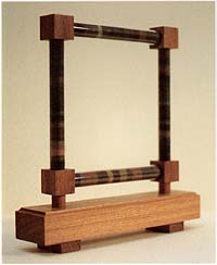
Bubble & Squeak
Height 30 cm, 1991
488 x 400 pixels, 26 Kb
744 x 610 pixels, 49 Kb
939 x 770 pixels, 67 Kb
Growingly I thought it strange that, though so diligent in using the left over oil paint to make the Terminal Grey series, I ignored the waste in other areas of work. Acrylics have proved a problem in this regard and I have tried many methods, none of which have proved completely satisfactory. It began to seem inconsistent (at least to the anal/retentive artist in question) to discard the rich leavings of chalk, charcoal and pastel that lie on the floor after each day's drawing. It must not be imagined however that this represents a tidy or houseproud disposition. My workplace is a heaped chaos of books, materials, unread papers and defunct tools: the studio, like its occupant, suffers from piles.
My love of recycling has little to do with 'green' issues. It is more an image of the economic life as a guide to the artistic; an analogy (once made explicit by Andy Warhol) of the factory with the studio. Also shadowily present is the idea of a diary of activity.
The title, Bubble and Squeak refers to one of my favourite dishes (cf. Curriculum Vitae X) and the fact that the combination of prosaic leftovers may, by culinary alchemy, produce a unique taste which cannot be arrived at if attempted with fresh ingredients. Thus, unpromising little heaps of dust in which the granules of pigment are mixed with the grindings of the various erasers, gain piquancy when filed and phialled. The format is not new of course for it echoes those souvenirs of beaches where there are coloured sands, such as Alum Bay in the Isle of Wight.
The title also relates to what first brought the work into existence. Asked by the Ivy restaurant if I would provide some sculpture for a shelf in front of a glass screen that I had made, I thought of a series of objects all of which would incorporate glass and relate in some way to food (many of the ingredients here have themselves been cooked as in the burnt wood of the charcoal and the scorched earth of the siennas and umbers). It is in some small part the result of my enthusiasm that the dish itself appears on the Ivy menu.
The format self-evidently echoes a frame, as if to say that this residue is what remains then the picture has been taken away. It also recalls the various framing devices and borders of earlier pictures whose surround featured colour catalogues and sequences of terminal greys. In the structure (made by Andy Gizauskas) the idea of the spice rack is not far away.
This first version was succeeded by another whose diamond-shaped format better suited the restaurant, matching as it did the patterns already established in the glass.
Work and Texts (1992), p. 40.
tomphillips.co.uk > > Sculpture & Mixed Media